
NETWORK NEWS
Neuropea changes its visual identity

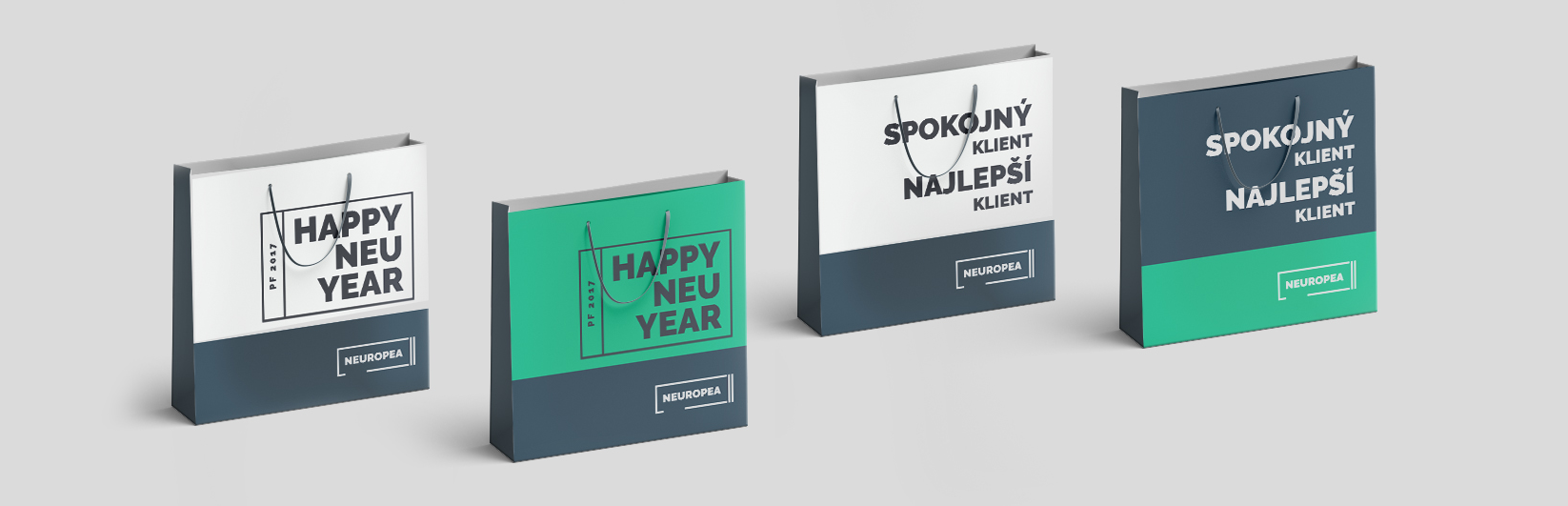
Dominant typography, minimalism and a use of geometric shapes. These three characteristics capture the new visual identity of Neuropea, which was in 2017, after ten years in business. Square and rectangle as basic geometric shapes express rationality and practicality, but, at the same time, they express the important role that communication plays in society.
Public Relations and Public Affairs, the areas of primary interest to Neuropea, are going through significant changes. There is a need for effective and targeted communication, using the internet and social media, with the right mix of creative content and attractive visual execution.
Dynamic times of modern society full of information and initiatives force companies to simplify their visual communication and key messages.
“That’s part of the reason why we have decided to change our visual identity, to send out a clear message to our clients, partners and suppliers, but also to our employees” says Neuropea CEO Peter Papanek. “To summarize, the simplicity and modern form full of quality content expresses the style in which Neuropea will continue to work and offer its professional services to clients also in the upcoming years” concludes Papanek.
Redesigning Neuropea’s logo and other visual tools has, according to the CEO, hidden symbolism – it represents a general change in the way of communication in Public Relations and also reflects turbulences in Public Affairs. The original logo was replaced by a new, purely typographical one, based on a modern, elegant and distinctive font. It contains the name of the agency that carries the phrase “New Europe” and therefore the “NEU” is optically highlighted by the interruption of the border lines, while the two bold lines on the right of the logo are symbols of the two main spheres of Public Relations (PR) and Public Affairs (PA).
The original logo of Neuropea was a combination of gray and wine color, the new logotype will be used exclusively in its dark blue form on a light background and vice versa. The visual identity is complemented by a unique shade of green, which is a symbol of vitality and harmony, in this case the harmony between PR and PA.
Both areas of the agency´s responsibility are also expressed by abstract icons: in PR, there are two parallel lines symbolizing the continuous development of communication, its continuity and progress; in PA, on the contrary, there is a sharp-edged curve symbolizing frequent changes and turbulences in the public sphere. These icons will symbolize graphical supplement not only on the agency’s website, but also in various presentations and corporate items.

